The Receiver Operating Characteristics (ROC) plot is a popular measure for evaluating classifier performance. ROC has been used in a wide range of fields, and the characteristics of the plot is also well studied. We cover the basic concept and several important aspects of the ROC plot through this page.
For those who are not familiar with the basic measures derived from the confusion matrix or the basic concept of model-wide evaluation, we recommend reading the following two pages.
If you want to dive into making nice ROC plots right away, have a look at the tools page:
ROC shows trade-offs between sensitivity and specificity
The ROC plot is a model-wide evaluation measure that is based on two basic evaluation measures – specificity and sensitivity. Specificity is a performance measure of the whole negative part of a dataset, whereas sensitivity is a performance measure of the whole positive part.
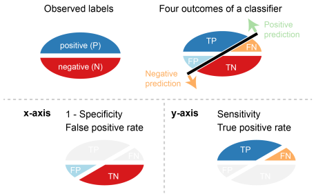
The ROC plot uses 1 – specificity on the x-axis and sensitivity on the y-axis. False positive rate (FPR) is identical with 1 – specificity, and true positive rate (TPR) is identical with sensitivity.
Making a ROC curve by connecting ROC points
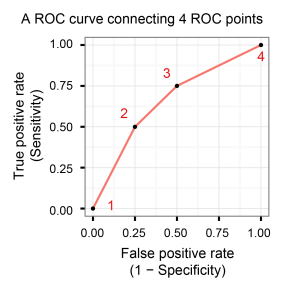
A ROC point is a point with a pair of x and y values in the ROC space where x is 1 – specificity and y is sensitivity. A ROC curve is created by connecting all ROC points of a classifier in the ROC space. Two adjacent ROC points can be connected by a straight line, and the curve starts at (0.0, 0.0) and ends at (1.0, 1.0).
An example of making a ROC curve
We show a simple example to make a ROC curve by connecting several ROC points. Let us assume that we have calculated sensitivity and specificity values from multiple confusion matrices for four different threshold values.
| Threshold | Sensitivity | Specificity | 1 – specificity |
|---|---|---|---|
| 1 | 0.0 | 1.0 | 0.0 |
| 2 | 0.5 | 0.75 | 0.25 |
| 3 | 0.75 | 0.5 | 0.5 |
| 4 | 1.0 | 0.0 | 1.0 |
We first added four points that matches with the pairs of sensitivity and specificity values and then connected the points to create a ROC curve.
Interpretation of ROC curves
Easy interpretation of a ROC curve is one of the advantages of using the ROC plot. We show how to interpret ROC curves with several examples.
A ROC curve of a random classifier
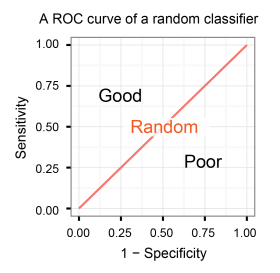
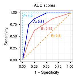
A classifier with the random performance level always shows a straight line from the origin (0.0, 0.0) to the top right corner (1.0, 1.0). Two areas separated by this ROC curve indicates a simple estimation of the performance level. ROC curves in the area with the top left corner (0.0, 1.0) indicate good performance levels, whereas ROC curves in the other area with the bottom right corner (1.0, 0.0) indicate poor performance levels.
A ROC curve of a perfect classifier
A classifier with the perfect performance level shows a combination of two straight lines – from the origin (0.0, 0.0) to the top left corner (0.0, 1.0) and further to the top right corner (1.0, 1.0).
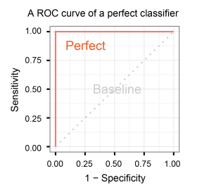
It is important to notice that classifiers with meaningful performance levels usually lie in the area between the random ROC curve (baseline) and the perfect ROC curve.
ROC curves for multiple models
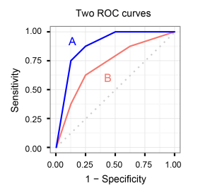
Comparison of multiple classifiers is usually straight-forward especially when no curves cross each other. Curves close to the perfect ROC curve have a better performance level than the ones closes to the baseline.
AUC (Area under the ROC curve) score
Another advantage of using the ROC plot is a single measure called the AUC (area under the ROC curve) score. As the name indicates, it is an area under the curve calculated in the ROC space. One of the easy ways to calculate the AUC score is using the trapezoidal rule, which is adding up all trapezoids under the curve.
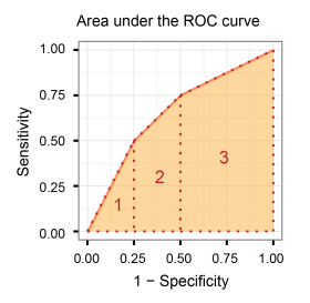
Although the theoretical range of AUC score is between 0 and 1, the actual scores of meaningful classifiers are greater than 0.5, which is the AUC score of a random classifier.
3 aspects that can be problematic with the ROC analysis
All performance measures have their advantages and disadvantages. Even thought ROC is a powerful performance measure, the performance evaluation is likely inaccurate if the plot is interpreted in a wrong way.
Use dissimilar datasets in one ROC plot
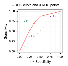
This is a common mistake when ROC is used for comparing multiple classifiers. One ROC curve with several ROC points are drawn in one plot. The comparison between them is valid only when the classifiers are evaluated on either a single dataset or multiple datasets that are almost identical among each other in terms of their data size and positive:negative ratio.
Rely only on AUC scores
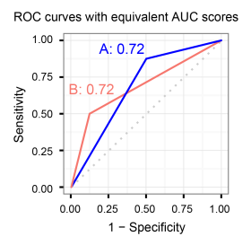
AUC scores are convenient to compare multiple classifiers. Nonetheless, it is also important to check the actual curves especially when evaluating the final model. Even when two ROC curves have the same AUC values, the actual curves can be quite different.
ROC analysis in conjunction with imbalanced datasets
ROC becomes less powerful when used with imbalanced datasets. One effective approach to avoid the potential issues with imbalanced datasets is using the early retrieval area, which is a region with high specificity values in the ROC space. Checking this area is useful to analyse the performance with fewer false positives (or small false positive rate).
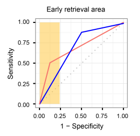
Moreover, the AUC score can be calculated for any partial area of the ROC curve. The most common approach is calculating ROC50, which adds up true positives until the number of false positives reaches 50. The number of false positives can be any value instead of 50 depending on the data size and some other criteria.
Analysing the early retrieval of ROC is not sufficient in some cases, however. For more details about the potential issues with imbalanced datasets, we recommend reading the following pages.

your plots here are beautiful. Can you post the R code used to generate these plots?
LikeLike
Hi,
I used Precrec, which is an R package we’ve developed, to produce vector image files, such as pdf and eps. I then edited these files with a vector graphics application.
Vector graphics editors
Code snippet
# Load libraries

library(precrec)

library(ggplot2)
# Set scores and labels
scores <- c(1.9, 1.3, 2.8, 0.5, 0.2, 0.1, 2.5, 2.2)
labels <- c(1, 0, 1, 1, 0, 0, 1, 0)
# Calculate ROC and precision-recall
curves <- evalmod(scores = scores, labels = labels)
# Plot with ROC and precision-recall
autoplot(curves)
# Plot with ROC only
autoplot(curves, curvetype = c("ROC"))
LikeLike
I am new to ROC curves and have a question about how they are used for model building. In your example you have two classifiers: A and B. You show that A outclassifies B with a higher AUC and better curve, but I am wondering if you can combine A and B and assess this joint ability of the two tests to see if this will enhance the predictive ability. Or is it not appropriate to combine?
LikeLike
You can use ROC curves for comparing different hypotheses (candidates of your final model) and different models (developed by different machine learning methods, for instance), with their AUC scores indicating their prediction performance.
>if you can combine A and B and assess this joint ability of the two tests to see if this will enhance the predictive ability
Combining curves doesn’t make sense in the ROC plot. You may combine models and hypotheses during training using a meta-algorithm, such as ensemble, boosting, and multiple classifier systems, but not at validation or evaluation phases.
LikeLike
hiihow can i plot probability detection and probability false alarm in ROC in python please reply
LikeLike
Sorry, but I don’t know which library provides accurate calculations of ROC curves in Python. I simply use the roc_curve and plot_roc_curve functions provided by scikit-learn. They are not perfect but good enough in most cases.
LikeLike